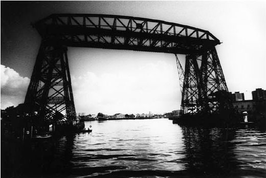
Daido Moriyama is a personal hero: after all, one of his photos graces the header of this blog. Two of his recent shows, though, have been a bit disappointing.
Let’s back up for a second. Moriyama’s signature style is a black-and-white photograph which has been exposed, developed and printed with an eye towards extreme contrast. It is hard to mistake one of his stronger photographs for the work of anyone else. When looking at a book of Moriyama’s photos, you might not be drawn into each image, but they can all generally hold your attention. When you do make a connection with an image, the effect is heightened because of the striking tones of black and white. At his best, Moriyama makes it pleasurable to look at a very plain image, because it has been modified so dramatically by his process.

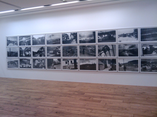
So what could go wrong with an exhibit? In short, presentation. The first show I saw was a joint exhibit with the Brazilian photographer Miguel Rio Branco. Moriyama photographed São Paulo, and Rio Branco photographed Tokyo. On the way into the exhibit were five Moriyama prints, well spaced out in a line. This gave time to look at each image. So far so good, but then came the centerpiece of Moriyama’s contribution. Imagine a wall 50 feet long. Then imagine that wall completely covered in a grid of about 100 photographs, all printed quite large, in borderless frames and mounted within an inch of each other. If it’s hard to visualize this, here’s a cellphone picture of the other exhibition I saw (“Hokkaido”), which was presented in the same way:

Maybe Moriyama’s books are thrown together at random, but this way of exhibiting seems like a way of not actually editing his work. When you want to move on from one image, your eye can go in eight different directions! I suppose that this presentation does highlight Moriyama’s process—the effect of seeing so much beautifully realized contrast in one place is striking. But it’s also overpowering: how are you supposed to look at anything?