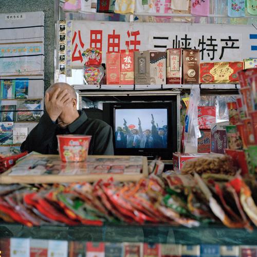
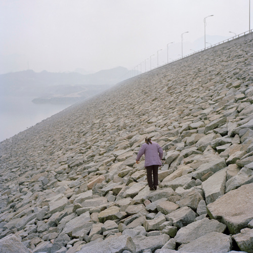
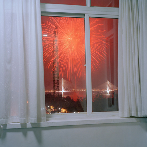
“I just think there’s nothing more satisfying than the narrative thrust: beginning, middle, and end, what’s gonna happen. The thing I’m always bumping up against is that photography doesn’t function that way. Because it’s not a time-based medium, it’s frozen in time, they suggest stories, they don’t tell stories. So it is not narrative. So it functions much more like poetry than it does like the novel. It’s just these impressions and you leave it to the viewer to put together.”
I would like to start this post by introducing the word “Akaakaesque,” a term coined after the art book publisher Akaaka-sha. Akaaka has established a strong point of view for themselves in photography books, and while not every book they publish is actually Akaakaesque, they are consistent about publishing color work which is highly personal, to the point of willfully excluding the “real” world, or the one outside of the photographer’s head. In cinematic language, this might be close to cinéma d’auteur—damned if the photographer’s going to let anything get in the way of their vision.
Aya Fujioka’s “I Don’t Sleep” is published by Akaaka-sha, and it strikes me as extremely Akaakaesque. Events in Fujioka’s life push this book along, and more than an exploration of photographic technique or “photography itself,” they provide the tension which makes “I Don’t Sleep” quite difficult to put down once you’ve started looking at it. These photographs document a family trauma, and it sometimes seems as though Fujioka wants to grip the viewer, hold them up to her experience and not let go. If this sounds uncomfortable, it can be, but the book’s palpable intensity really sets it apart.
What makes the work so strong, though, is that Fujioka does not generate this intense effect through an exploitative or overly sentimental treatment of her subject. On the contrary, she has made an honest effort to communicate her experience as clearly as possible. If the work is not actually, as it were, clear, this isn’t because Fujioka set out to make a vague book.* The structure of “I Don’t Sleep” provides some insight here.
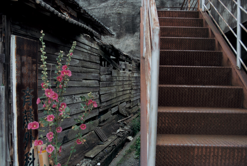
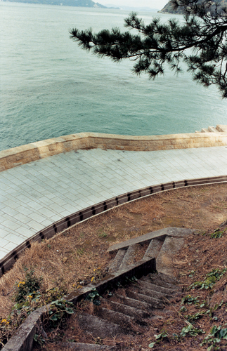
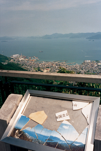
The first half of the book establishes Fujioka’s photographic style: basically, a refined snapshot. To be successful, snapshots usually rely on a tension between elements in the frame, and there is certainly tension running through these images: we see the strange combination of a flower bush and a staircase, a stray branch filling out the composition of an empty scene, and a fractured vista signboard in front of view it’s supposed to represent. In each case, the images have a tenuous balance; this is particularly true of the flower and the staircase, whose equal weight within the picture strikes me as quite strange. There are slight indications that the photographer is traveling somewhere, with someone else, but still, these photographs don’t indicate what’s happening.
The second part of the book addresses the central trauma more directly, and brings home the intensity of Fujioka’s experience. Up until this point, the book is edited like a collection of snapshots; there’s always a clear change of place and subject from one page to the next. But the second part starts off breaking this rhythm, with two separate 8-page digressions, each showing a series of one thing, all taken from similar perspectives. (You can see some of these photos in the Japan Exposures gallery.) These digressions come as a shock, certainly with respect to the pacing and editing of the book, but also because they it reveal the reason for Fujioka’s journey, and maybe also why she “Can’t Sleep.” They almost make a red herring out of the first half of the book—its delicate tension can be read differently in this new light, but it seems more like a foil for the second half, a kind of misdirection to bring you in close before revealing something darker. These two passages make the intensity of Fujioka’s experience clear.
After Hiromix, there have been any number of books published in Japan of color snapshots, especially by women. But “I Don’t Sleep” distinguishes itself from this crowd through its tight sequencing: the book has a beginning, middle, and end, always striving to maintain clarity in the face of severe personal stress. It’s an impossible task, of course, but as a method it yields compelling results. “I Don’t Sleep” is more than just Akaakaesque—this word imparts nothing of the coherency of the book. There are dramatic events here, but no dramatic effects. “I Don’t Sleep” came out in late December of last year, which makes it either the last essential book of 2009, or the first essential book of 2010.
Available at the Japan Exposures store.
* We could say that each photo is like a musical note which needs to be arranged to create a coherent piece of music. On its own, the photograph has only a tangential relation to experience. The work might have an internal coherency, but even then, expecting it to have some meaningful relationship to experience is like hoping for a spiritual revelation after sending some holy book through a game of “telephone.” (Which doesn’t mean it couldn’t happen)
