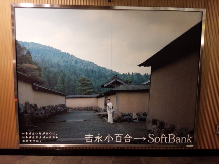
Roppongi Station
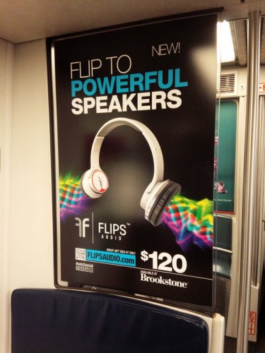
LIRR
These are extreme examples, but I think on some level this post speaks for itself. How to read these images is another question.
Tags (1)
Literacy
Roppongi Station

LIRR
These are extreme examples, but I think on some level this post speaks for itself. How to read these images is another question.
Tags (1)
LiteracyAfter Naoki Inose’s tragicomic turn as governor of Tokyo, in which he eventually called himself an “amateur” politician after accepting improper campaign donations 1, there will be an election this coming Sunday. Here are some of the campaign posters.
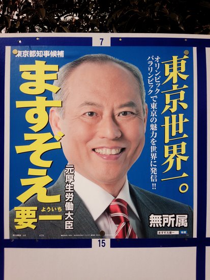
Yoichi Masuzoe
You’re looking at the next governor of Tokyo, if the polls are to be believed. Masuzoe knows exactly what he’s doing here: flashes dialed up all the way, bouncing off of every surface of his skull—check out the glint in his eyes and the beams of light radiating off of his lips! A mayor right out of a catalog.
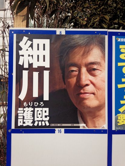
Morihiro Hosokawa
Ex-Prime Minister who has teamed up with lion-maned 2 Elvis fanatic 3 ex-Prime Minister Junichiro Koizumi to run on a strong anti-nuclear campaign. His photo rates the highest in terms of visual quality; I like the “artful” crop, and the wood behind him actually looks a lot darker in real life.
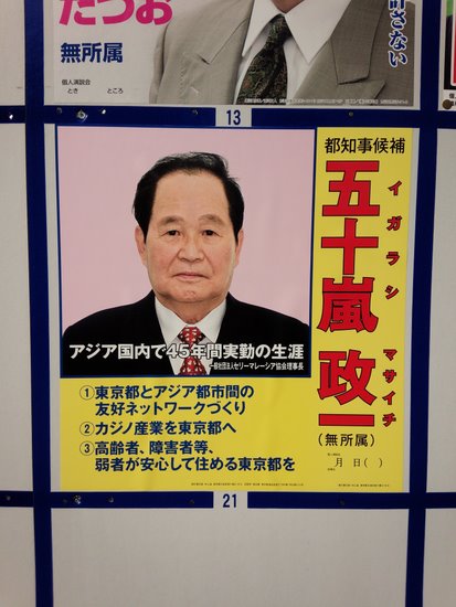
Masaichi Igarashi
My man! Even if you can’t understand Japanese, you may enjoy watching Igarashi’s rambling campaign speech 4. Igarashi ought to go down in history along with other notable Tokyo candidates like smooth-talking rocker Yuya Uchida 5 and furious anarchist Koichi Toyama 6. In any case, this photo looks more like a mugshot to me.
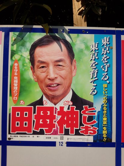
Toshio Tamogami
Tamogami is a retired air force officer, and is by far the most conservative entrant in the field. I think his photograph looks quite good; someone did a nice job color-correcting his face and the green background is a nice touch.
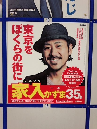
Kazuma Ieiri
The poster loudly touts Ieiri’s age, 35. He’s a tech entrepreneur who lists a ton of ideas for the city on his site, some of which seem reasonable. Still, he certainly won’t win this time. Anyway, for all of his tech skills I’m surprised he didn’t hire a better retoucher—his face is totally washed out, and if Tamogami can get himself to look young and sprightly, why can’t the actually young and sprightly guy manage the same?
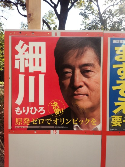
I just saw this a couple of hours ago before finishing up this post. I’m not sure if all of Hosokawa’s posters have been modified in this way or not, but perhaps someone decided it was time to ditch the “arty” look.
Update 2/12/14: As expected, Masuzoe won the election, despite Hosokawa’s furious late push to switch his campaign posters to this easier-to-understand red version, which I did in fact see pasted up all over the city. Meanwhile, Paul Roquet suggested on Twitter that certain laws may govern the appearance of campaign posters, resulting in their uniform appearance. I couldn’t find any information about such laws, though it would be very interesting to hear about them if they exist. While trying to find this information, though, I did come across a business specializing in election posters 7. Something to keep in mind if you ever decide to run for office here.
Update 4/19/14: Paul Roquet has come across an academic study (it’s behind a paywall) of campaign posters 8 which claims to “present the legal provisions regulating” them.