You may have seen the trailer for the film “How to Make a Book With Steidl,” which looks like essential viewing for people interested in photobooks. (Despite being posted on some “major” blogs, the trailer only has 10,000 views, which I guess says something about the overall popularity of the field.) I haven’t seen the movie yet, but last week I went with Tosei-sha’s Takahashi Kunihiro to watch him make Deguchi Kozue’s book “緑絽” (Ryokuro), or loosely translated, “Green Gauze.” Takahashi-san uses a couple of different printing companies, but this time a small group of us piled into his van and drove to Tokyo’s Toppan Insatsu (凸版印刷), one of the largest printing presses in Japan.
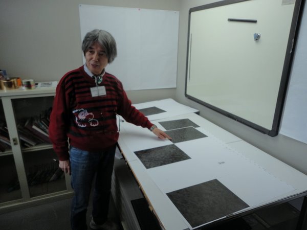
Takahashi-san has made a name for himself as a master black and white printer: he’s been doing it for 20 years, and his trademark move is blending the black and gray inks himself. For this book, he used a black ink containing 60% red and 40% blue, and a gray ink with 5 different colors that I’ve completely forgotten. I say “the black had 60% red and 40% blue,” but I’m not really sure what that means technically. Obviously the ink looks black, but I don’t know if we’re talking about blue “hues” or “pigments” here.
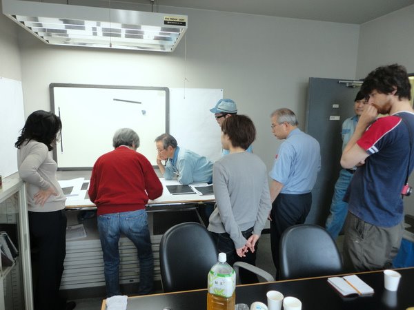
Deguchi’s book has 50 images on 100 pages, so the goal for this day was for her to sign off on 7 sheets, each containing 4 images. Deguchi and Takahashi would then go back the next day to finish up the rest. In the photo above, Deguchi and Takahashi are reviewing a test sheet, literally hot off the press, with the print operators. If there are any adjustments to be made, the operators will come back about 15 minutes later with the next version.
The pensive-looking Italian gentleman in the right of this photo is Pierfrancesco Celada, who was here working on a long-term project on Japanese cities. His site is worth visiting, he has a very good eye.
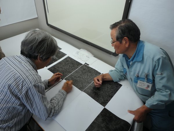
I didn’t realize this, but to make something appear brighter on the page, you actually add black to it. Say that you have something that’s 10% white and 90% black. The difference between the two is 80%. If you double the black, then you have 20% and 180%, which makes for a much bigger difference. There’s actually more black there, but the eye perceives it as being more white. This is all according to Takahashi-san at least, the numbers sound a bit sketchy but I think that perhaps the percentage shouldn’t be taken too literally.
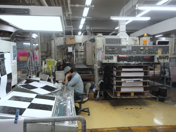
The workstation on the factory floor. Here’s a video showing the printing machine whirring up and sending the sheets through. As it got going, the head of the department said to me, “man, I never get tired of watching this…”
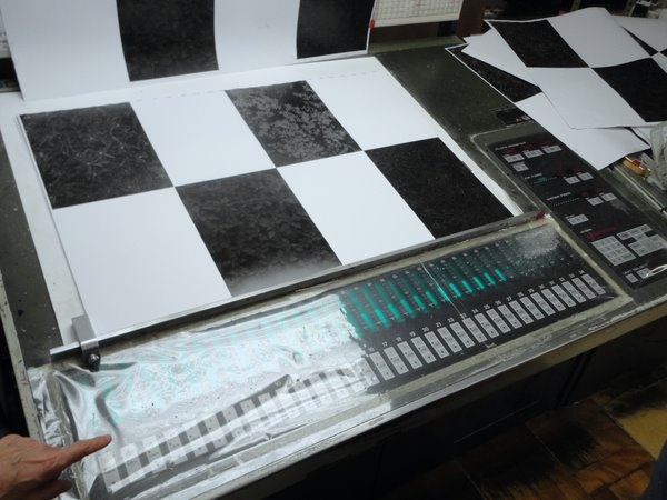
With this machine, you can bump up the ink levels, limiting the affected area to only a certain part of the sheet. The control isn’t pixel-level, of course.
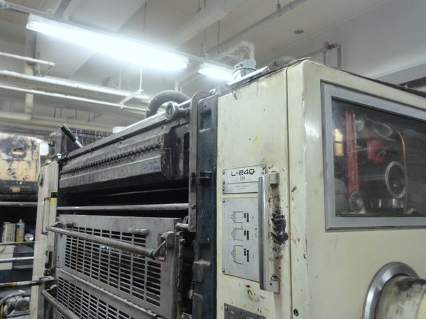
The black knobs here correspond to the levels that were set on the machine above.
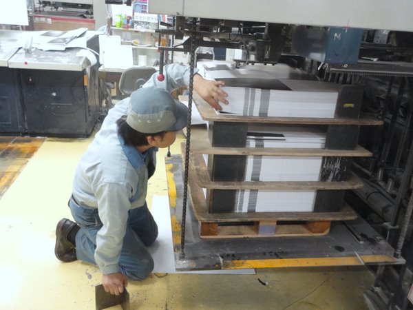
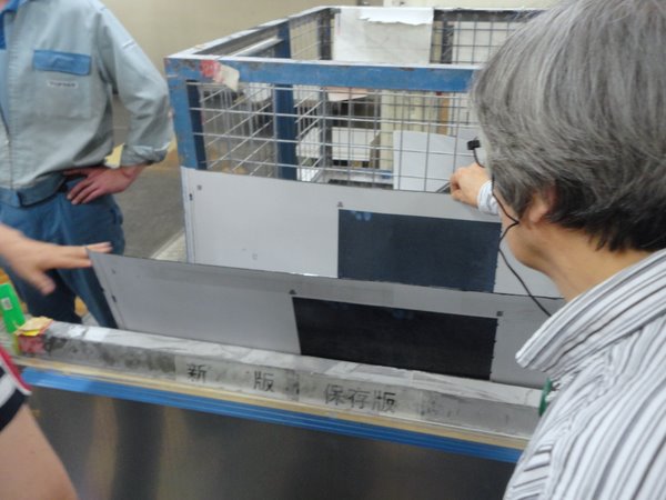
These are the plates for the black and gray ink. They’re flexible, so that they can grab the ink, then roll it on to a rubber roller, which in turn rolls it on to the paper.
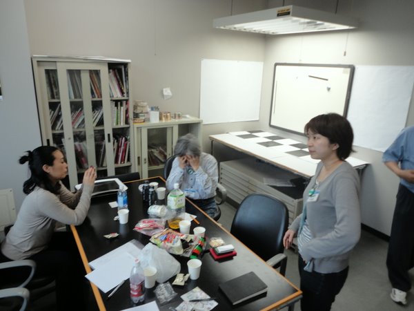
That’s Deguchi-san on the left, and Tomomi Matsutani on the right. Matsutani-san is a young photographer who has published a couple of interesting zines, and helped run Onaka Koji’s Gallery Kaido during 2010.
Takahashi-san looks like he’s having a miserable time here, but that’s not the case at all. The whole day was stress-free, and even though there’s a lot of downtime waiting for the revisions to come back, there was good banter back and forth between everyone to keep things interesting.
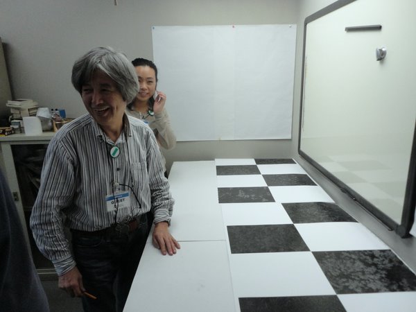
The man in his element.
